Tools

Tools

Figma, Sketch, Zeplin, UserTesting

Figma, Sketch, Zeplin, UserTesting

Timeframe

Timeframe

Jan 2022- May 2022

Jan 2022- May 2022

Context:

A fragmented, outdated registration process was causing drop-offs along the funnel. Lack of transparent, accessible information and key steps of the flow being separate from sign-up left users uncertain as to their progress and next steps required.

My role:
  • Planning and conducting user research through user testing and interviews, system mapping workshops with product, dev and busines.

  • Defining interactions, dev handoff and QA testing.

  • Ideation for new concepts.

  • Working with design system team to create new components.
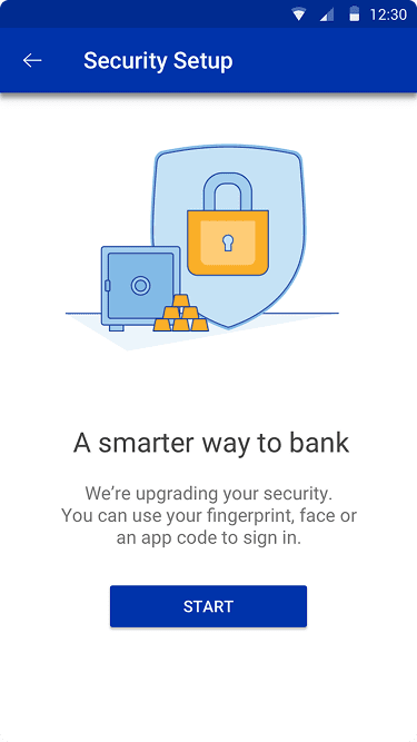
Quick wins

Data from funnels, customer care and heuristic evaluation lead to many fixes being made in different points across the flow in terms of information affordance, visual consistency and increased visibility. Here are a few of these:

Data from funnels, customer care and heuristic evaluation lead to many fixes being made in different points across the flow in terms of information affordance, visual consistency and increased visibility. Here are a few of these:

Information display

Before

People were entering the link and secure flow and being forced to dropoff halfway, as the disclaimer about mandatory documents needed was placed inside the flow and not given any prominence, wasting users time.
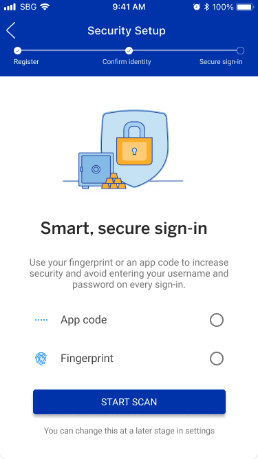
After

Adding a mandatory selection for the ID before letting users proceed with the flow. As link and secure is used by multiple teams and third parties with different staring points, placing the selection in each usecase was important

Speed

Before

Multiple repetitive screens to tell users about a process before they start it lengthened the flow unnecessarily and made users miss out on a lot of important information as they ended up clicking through the screens quickly.

After

Condensing and summarising the information into a single screen with actionable buttons at the end rather than generic CTAs ensures that users don't miss out on any important points and aren't fatigued before starting a process.

ease of access

Before

Directing users away from the flow when they wanted to get queries answered greatly lengthened the process, caused friction and led to dropoffs as peopele couldn't/ didn't want to navigate back to the flow .

After

Directly giving users answers to the most common doubts as well as helpline numbers in case they needed more assistance in app ensured that they did not need to move out of the flow.

Digging deeper

Interviews

User testing

First, we put the flow through unmoderated user testing where around 80 participants went through the existing flow and registered themselves on the app in an unmoderated test over a period of 3 days.The heatmaps and clickpaths from this, as well as insights from follow up questions gave us an understanding of app usage and issues. Here are some of the main findings

54%

of users wanted some improvements in the flow. The main confusions were around terminology (preferred name/ username, home/ work), and the isolation of registration and account opening.

45%

of people had concerns around the verification code. Wanting more flexibility, unable to access the email address immediately, or being unhappy at needing to leave the app in between the process caused significant dropoffs.

32%

of people were not sure how much of the process was left, although most people did have a good understanding of what they were doing currently and why it was needed.

~40%

dropped off in the first screen, mainly because the number of different buttons was overwhelming, cluttered and not immediately obvious where to click.

System
mapping

System mapping

After research, we attempted to come up with UX and flow enhancements. These ran into roadblocks because of different stakeholders having different opinions on how the current infrastructure looks.

To bring clarity across the team, we ran alignment workshops to map how the system looks today: with the front stage actions, service calls, players involved, as well as business and user concerns and rules.

Main problem areas and interventions

Engagement

While comfort with technology is rising, people still miss, and feel the value of a human connection especially with a potentially long term service provider.

Engagement

While comfort with technology is rising, people still miss, and feel the value of a human connection especially with a potentially long term service provider.

Personalisation

With the number of options available to people, tailoring experiences becomes important to maintain brand loyalty and avoid choice fatigue.

Personalisation

With the number of options available to people, tailoring experiences becomes important to maintain brand loyalty and avoid choice fatigue.

Transparency

People don't mind a slightly longer process that is easy to complete, but want to know the 'why' behind certain information rather than just generic terms like "smart", "secure"

Transparency

People don't mind a slightly longer process that is easy to complete, but want to know the 'why' behind certain information rather than just generic terms like "smart", "secure"

Speed and flexibility

With people being more comfortable with a variety of apps, the expectation for the registration in banking apps to be as flexible and quick is rising.

Speed and flexibility

With people being more comfortable with a variety of apps, the expectation for the registration in banking apps to be as flexible and quick is rising.

Concept exploration

Mimic the conversation with a bank teller into the digital world, with minimal elements on each screen, and questions asked in a staggered format. User needing to respond at each step to proceed to the next ensures that nothing is missed and the flow feels as organic as possible.

Reason for rejection

The casual, conversational aspect was received well by customers as it felt more natural than a standard digital experience.

However, this increased length of the process and was not seen as a worthwhile tradeoff. Since account origination is a long process, the number of extra clicks was enough to induce fatigue.
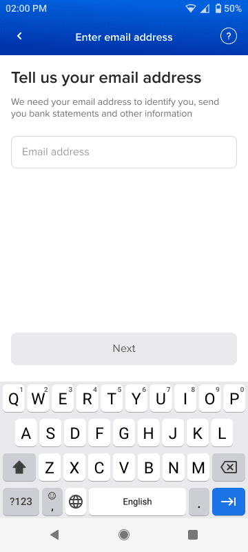
What we went ahead with

What we went ahead with

Starting the flow

Higher load times are handled with more engaging visuals, while the number of actions on the screen is reduced from >6 to just 2. Using a customers email address and mobile number to determine relationship with the bank and fetch accounts, creating a more personalised experience for each user.

Account selection

Informative screens

Ending the flow

How it works

Here's how the registration flow works for a new to bank customer, followed by the account opening flow for someone that's already registered.

These might take a while to load!

Reception

  • User testing using these showed higher levels of engagement and interest

  • Time taken to complete the flow to the sign-in stage was reduced

What's next?

Most of the designed solutions have been confirmed as technically feasible, using the same blueprint created earlier, so the next steps would be to map out and design for users who have mobile banking enabled, people with older devices, existing customers etc.