BANKING
Registration flow for Standard bank
Registration flow for Standard bank
Redesign of the registration and account origination flow on the mobile app for Africa's largest bank. The aim was to make it quicker, more secure and engaging, enabling them to draw newer audiences to their platform.
With user-centered approach, the goals was to create an intuitive interface for effortless financial management while incorporating gamification.

Tools
Tools
Figma, Sketch, Zeplin, UserTesting
Figma, Sketch, Zeplin, UserTesting
Timeframe
Timeframe
Jan 2022- May 2022
Jan 2022- May 2022
Context:
A fragmented, outdated registration process was causing drop-offs along the funnel. Lack of transparent, accessible information and key steps of the flow being separate from sign-up left users uncertain as to their progress and next steps required.
My role:
Planning and conducting user research through user testing and interviews, system mapping workshops with product, dev and busines.
Defining interactions, dev handoff and QA testing.
Ideation for new concepts.
Working with design system team to create new components.
Quick wins
Quick wins
Data from funnels, customer care and heuristic evaluation lead to many fixes being made in different points across the flow in terms of information affordance, visual consistency and increased visibility. Here are a few of these:
Data from funnels, customer care and heuristic evaluation lead to many fixes being made in different points across the flow in terms of information affordance, visual consistency and increased visibility. Here are a few of these:
Information display
Before:
People were entering the link and secure flow and being forced to dropoff halfway, as the disclaimer about mandatory documents needed was placed inside the flow and not given any prominence.
After:
Adding a mandatory selection for the ID before letting users proceed with the flow. As link and secure is used by multiple teams and third parties with different staring points, placing the selection in each usecase was important
Speed
Ease of access
Starting the flow


Information display

Before:
People were entering the link and secure flow and being forced to dropoff halfway, as the disclaimer about mandatory documents needed was placed inside the flow and not given any prominence.
After:
Adding a mandatory selection for the ID before letting users proceed with the flow. As link and secure is used by multiple teams and third parties with different staring points, placing the selection in each usecase was important
Speed
Ease of access
Starting the flow
Digging deeper
Interviews
User testing
First, we put the flow through unmoderated user testing where around 80 participants went through the existing flow and registered themselves on the app in an unmoderated test over a period of 3 days.The heatmaps and clickpaths from this, as well as insights from follow up questions gave us an understanding of app usage and issues. Here are some of the main findings
54%
of users wanted some improvements in the flow. The main confusions were around terminology (preferred name/ username, home/ work), and the isolation of registration and account opening.
45%
of people had concerns around the verification code. Wanting more flexibility, unable to access the email address immediately, or being unhappy at needing to leave the app in between the process caused significant dropoffs.
32%
of people were not sure how much of the process was left, although most people did have a good understanding of what they were doing currently and why it was needed.
~40%
dropped off in the first screen, mainly because the number of different buttons was overwhelming, cluttered and not immediately obvious where to click.
System
mapping
System mapping
After research, we attempted to come up with UX and flow enhancements. These ran into roadblocks because of different stakeholders having different opinions on how the current infrastructure looks.
To bring clarity across the team, we ran alignment workshops to map how the system looks today: with the front stage actions, service calls, players involved, as well as business and user concerns and rules.
Main problem areas and interventions
Speed and flexibility
Increasing digital literacy and options mean users expect greater ease, speed and payoff. Long load times, multiple explanatory screens, repetitive steps and fragmented forms cause dropoffs.
Speed and flexibility
Increasing digital literacy and options mean users expect greater ease, speed and payoff. Long load times, multiple explanatory screens, repetitive steps and fragmented forms cause dropoffs.
Engagement
While comfort with technology is rising, people still miss and feel the value of a human connection, especially with a potentially long term service provider. The first digital touchpoint with the bank cannot be static and flat.
Engagement
While comfort with technology is rising, people still miss and feel the value of a human connection, especially with a potentially long term service provider. The first digital touchpoint with the bank cannot be static and flat.
Personalisation
Tailoring flows is becoming increasingly important to maintain brand loyalty and avoid choice fatigue. Users increasingly expect customisation and relevance rather than being presented all possible options and flows at once.
Personalisation
Tailoring flows is becoming increasingly important to maintain brand loyalty and avoid choice fatigue. Users increasingly expect customisation and relevance rather than being presented all possible options and flows at once.
Transparency
People don't mind a slightly longer process that is easy to complete, but want to know the 'why' behind certain information rather than just generic terms like "smart", "secure"
Transparency
People don't mind a slightly longer process that is easy to complete, but want to know the 'why' behind certain information rather than just generic terms like "smart", "secure"
Concept exploration
Mimic the conversation with a bank teller into the digital world, with minimal elements on each screen, and questions asked in a staggered format. User needing to respond at each step to proceed to the next ensures that nothing is missed and the flow feels as organic as possible.
Reason for rejection
The casual, conversational aspect was received well by customers as it felt more natural than a standard digital experience.
However, this increased length of the process and was not seen as a worthwhile tradeoff. Since account origination is a long process, the number of extra clicks was enough to induce fatigue.
What we went ahead with
1/4
Starting the flow
Currently, a static loading state causes dropoffs. The first screen has more than 6 CTAs, overwhelming users and causing misclicks.
Higher load times can be handled with more engaging, informative visuals.
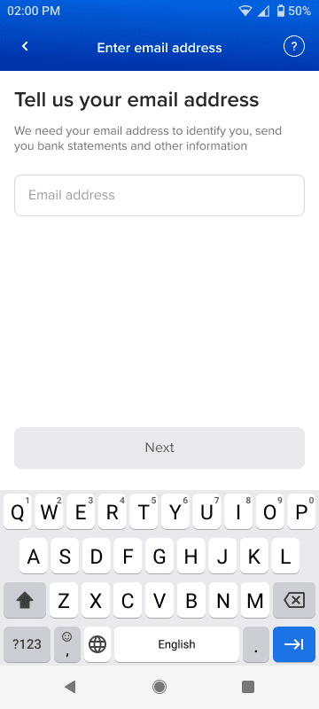
Using email address to determine relationship with the bank and give different users different paths reduces the CTAs here to just 2 clear entrypoints.


2/4
Account selection
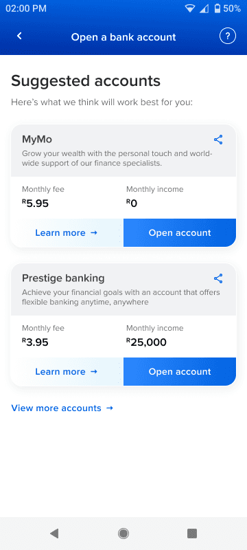
Currently, the choice fatigue is high, with users being presented with a long list of accounts. The form filling is fragmented - around 7-8 steps long.
Declarations around intent, income can be asked to preemptively suggest accounts to users.
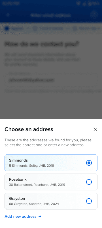
Clubbing similar information and fetching data when possible can shorten the form to be within 3 steps.

3/4
Informative screens
Minimal, repetitive informative screens cause delays and make users miss out on information. Asking for all permissions at once makes users less likely to grant access, hampering flow completion.
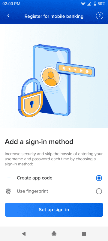
Multiple informative screens are condensed into just 1 richer screen per step, that have actionables to ensure key information is not missed.
Permissions are asked contextually, users know why it's needed and are more likely to grant the same.


4/4
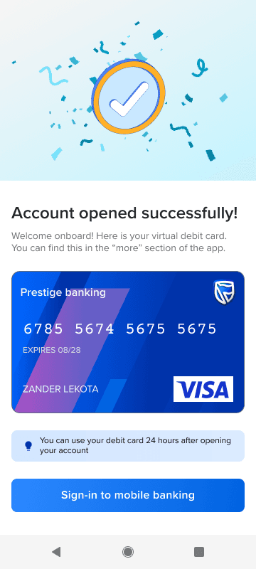
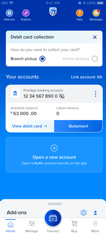
Ending the flow
Currently, the ending of the flow is abrupt and anticlimactic, lacking the warmth needed to mark starting a relationship with the bank.
Engaging messaging and providing users with a virtual debit card adds a sense of excitement and tangible reward.
Physical debit card pickup can be configured within the app, reducing the number of steps needed to open the account.

1/4
Starting the flow
Currently, a static loading state causes dropoffs. The first screen has more than 6 CTAs, overwhelming users and causing misclicks.
Higher load times can be handled with more engaging, informative visuals.
Using email address to determine relationship with the bank and give different users different paths reduces the CTAs here to just 2 clear entrypoints.
2/4
Account selection
Currently, the choice fatigue is high, with users being presented with a long list of accounts. The form filling is fragmented - around 7-8 steps long.
Declarations around intent, income can be asked to preemptively suggest accounts to users.
Clubbing similar information and fetching data when possible can shorten the form to be within 3 steps.
3/4
Informative screens
Minimal, repetitive informative screens cause delays and make users miss out on information. Asking for all permissions at once makes users less likely to grant access, hampering flow completion.
Multiple informative screens are condensed into just 1 richer screen per step, that have actionables to ensure key information is not missed.
Permissions are asked contextually, users know why it's needed and are more likely to grant the same.
4/4
Ending the flow
Currently, the ending of the flow is abrupt and anticlimactic, lacking the warmth needed to mark starting a relationship with the bank.
Engaging messaging and providing users with a virtual debit card adds a sense of excitement and tangible reward.
Physical debit card pickup can be configured within the app, reducing the number of steps needed to open the account.
Adding engagement
Here are some of the animations that make the flow richer.
Hover on them to play!
See it in action
Tap on the screens to proceed. These might take a while to load!
Here's how the registration flow works for a new to bank customer, followed by the account opening flow for someone that's already registered.
Register for mobile banking
Prototypes not loading?
Check out these links instead!
Prototype not working? Check out this link instead!
Prototypes not loading?
Check out these links instead!
Prototype not working? Check out this link instead!
Open MyMo account
Prototypes not loading?
Check out these links instead!
Prototype not working? Check out this link instead!
Prototypes not loading?
Check out these links instead!
Prototype not working? Check out this link instead!
Facial recognition
Prototypes not loading?
Check out these links instead!
Prototype not working? Check out this link instead!
Prototypes not loading?
Check out these links instead!
Prototype not working? Check out this link instead!
Reception and next steps
Closed group virtual user tests using these prototypes showed higher levels of engagement and interest.
Time taken to complete the flow to the sign-in stage was reduced using these compared to the live implementation.
While implementation would role out for new users first, different journeys like recovery, older users, accounts without mobile linked etc would be mapped out.


